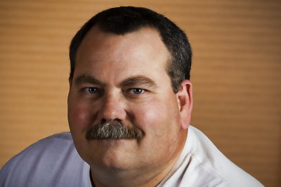
Title: "The Monk"

Camera / Lens: Canon 40D / Canon 17-55mm f/2.8 zoom
Post-processing: Photoshop CS3 > High Pass Sharpening > Merge Visible to New Layer > Topaz Adjust “Spicify” > Merge Visible to New Layer > Virtual Photographer "Character" # 50% Opacity > Merge Visible to New Layer > I cloned some foliage from a portion of the photo I ultimately cropped away to cover a tree truck in the middle of the background (and the subject's head)
I couldn't decide if I liked the color or B&W version better so here is the B&W version for your consideration as well (same processing as the color version with the addition of a B&W Adjustment Layer in Photoshop CS3).
Title: "B&W Monk"


3 comments:
I like the B&W version the best. Maybe Marvin has the right idea and every picture is better in B&W. Good shot, I think it's the best of your Ren Fest portraits so far.
Hi Larry! Thanks for your comment. I think I like the B&W better as well.
Cheers!
Barry
Barry,
i like the B&W better--I guess it is a Larry thing! Did you try any really radical crops, like cropping out all the trees above and to the right of his head? I was just looking for ways to simplify the image.
Patrick
Post a Comment