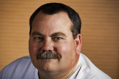
I originally posted this photo of Phil on Thursday, July 2 and received a lot of positive feedback related to it. One suggestion I had, offered by Larry Patrick (fellow Bay Area Photo Club member), was to remove some of the negative space between Phil and the photo on the wall in order to strengthen the relationship between the two. Larry's change to the photo, which I really liked, went even further than I did here by actually putting a portion of Phil's head in front of the wall photo. I tried various different spacing options and settled on this one that leaves a little more of the original negative space in place. I think this small change does improve the impact of the photo and would be interested to hear if you agree (scroll down three postings to see the original image).
Title: "Phil Redo"


4 comments:
Nice imrovements to the shot. Good work in Photoshop.
Great work in photoshop! I would like to see the artist's head 2-3" into the painting. I realize this infringes on his art, but it "sits" better with me bec/ of the negative space on the side. IMHO
Good work on a brilliant idea. Of course, I was a little more radical with the move, but I do believe this makes the connection between your subject and the background much better.
Nice work.
Thanks Larry, Shirley and Patrick!
I'm glad you like the improvements!
Thanks again for the suggestion Patrick!
Cheers!
Barry
Post a Comment