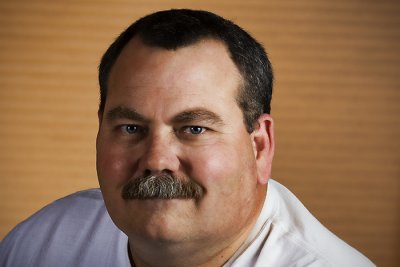
Title: "John"

Camera / Lens: Canon 40D / Canon 17-55mm f/2.8 zoom
Post-processing: Photoshop CS3 > Duplicate Background Layer > Topaz Adjust “Vibrance” > Merge Visible to New Layer > Lens Blur with mask to effect only the background > Merge Visible to New Layer > Spot Healing > Merge Visible to New Layer > Topaz Adjust Noise Reduction and Detail Reduction with mask to effect only the background > Merge Visible to New Layer > Distort Lens Correction Vignette


4 comments:
Hi Barry, nice portrait of your friend working. I think you captured the passion he has for his work -- he has a very satisfied look on his face. However, the blurring on the background doesn't look realistic, which immediately drew my attention. I suspect from previous experience with other filters that it might have been the noise reduction/detail reduction that caused the problem. You might try re-doing that step with more conservative settings and see if it comes out looking less blocky. If noise is a big problem in the background then an alternative you could try is a combination of light gaussian blur and slight darkening to make the background less prominent. Just one person's $0.02.
Hi Kyle!
On this shot I was actually going for an artistic interpretation of the background. The reality of the background in this shot is not especially interesting so I wanted to try and get creative with it. I can blame Ted Byrne for this! :-) Ted often uses the subjects from his photos as inspiration and goes completely artsy with the backgrounds (of course he does it much better than I). If you get a chance go to Ted's blog at www.imagefiction.blogspot.com and look at his posting on November 8, 2008 called "The Gliding Light" for an excellent example my inspiration (thanks Ted!).
I realize from your comment that where I may have gone wrong here was not going far enough away from reality to make it obvious that that was my intention. If I get a chance I'll try and push it further and re-post the photo and hopefully you'll let me know if I improved the photo or not to this end.
Thanks again for you comment!
Cheers!
Barry
After looking at Ted's post and re-reading your reply, I can see how taking the effect farther than you did would be very interesting. Here are a couple I did using a similar technique on the whole image.
Charlie
Cabana Palm
Hello Kyle!
That's exactly the kind of thing I was going for! I want to make the treatment say something about John though. Ted would be disappointed if I just used any old run-of-the-mill effect here! :-)
I'm making it my goal to post a revised image this weekend!
Cheers!
Barry
Post a Comment