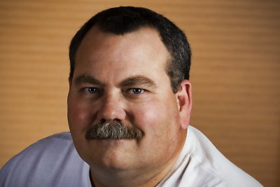
I had basically an eight foot square of area to work with as long as I could maintain a corridor through the middle of the space for foot traffic. The space was an art gallery and both walls available for backdrops were covered with art work. I didn't have enough room to get enough distance between the background and the subjects (subjects were 6" to 8" from the wall) to make it possible to blur the background and keep a good working depth of field. I don't have a portable background but I don't think the gallery manager would have allowed me to cover any of the art anyway. I guess the one option I had but didn't think of at the time was to rearrange the art and move a couple of the more distracting pieces to less prominent locations on the wall.
These five photos are fairly representative of the portraits I took that night. Any commments about how I might have improved the results would be greatly appreciated.
Title: "Party #1"

Shot data: 1/160s f/5.0 at 55.0mm iso400
Camera / Lens: Canon 40D / Canon 17-55mm f/2.8 zoom
Title: "Party #2"

Shot data: 1/125s f/4.5 at 55.0mm iso400
Camera / Lens: Canon 40D / Canon 17-55mm f/2.8 zoom
Title: "Party #3"

Shot data: 1/125s f/4.5 at 55.0mm iso400
Camera / Lens: Canon 40D / Canon 17-55mm f/2.8 zoom
Title: "Party #4"

Shot data: 1/160s f/5.0 at 44.0mm iso400
Camera / Lens: Canon 40D / Canon 17-55mm f/2.8 zoom
Title: "Party #5"

Shot data: 1/125s f/4.5 at 55.0mm iso400
Camera / Lens: Canon 40D / Canon 17-55mm f/2.8 zoom


3 comments:
Barry, there are times you just have to take what you have been given and not sweat it. We have all run into this situation ourselves. I think the whole point is knowing you could do better given better circumstances.
I think most of the art work in the background is pretty neutral with the exception of the bright red lips.
Nice portraits from a relatively simple lighting set-up. I think everyone will be very happy with your work.
Thanks Doug and Patrick!
I think everyone was happy with the results but I do wish I would have traded the "lips" photo in the background out with some other less identifiable and less contrasty photo. Oh well...I'll know to consider that option next time.
Cheers!
Barry
Post a Comment