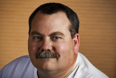
Same basic setup as yesterday's shot except I turned around the umbrella on my left and shot through it. I also lowered it and moved into a position closer to 65 degrees than 45 degrees. I also chimped the settings on both forward strobes until I found a balance I liked. All this was intended to yield a better self portrait than yesterday, after giving consideration to as many of yesterday's suggestions as possible. Hopefully this one is better!
Title: "Me Again!"


5 comments:
I liked this photo better than the previous one. The overall look is brighter and slightly harder than your first one. There is a little hot spot on the left forehead but it's not blown out.
I would still like to see you brighten the eyes a little as was suggested by others. You can do this by making a selection of your eyes and either using a brightness adjustment or even levels.
I took the liberty of tweaking a copy of your photo Barry, so you could see what I am talking about. I also applied a slight sharpening, about 17% in Nik Sharpener Pro 2.1, as I liked a slightly harder look. Check your email and it is in the psd format.
You're doing a great job! You know Larry P. will be all over it later on.
Now that looks more like me!
Great improvement! Self portraits are not easy --- you are brave to attempt this! The only improvement I can see would be a little more light on the right side of your face (camera left), maybe use a reflector as fill although you do have detail there. The slight smile is much better :)and I also like the white shirt instead of the gray.
Cindi
I agree, this photo is better than yesterdays..
Thanks for your comments Doug, Larry, Cindi and Stacey!
Doug and Cindi - I tried to incorporate your suggestions into my next post (even though the pose is less serious).
Cheers!
Barry
Post a Comment