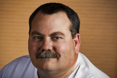
Anyway I had my camera with me (because I never leave it unattended in my car) and I decided to try another environmental portrait. I opened the blinds to try and add some interest to the ambient lighting and popped of three quick pics (I had given some pre-thought to the pose before he came in the room). This was my favorite of the shots I took.
Title: "Dr. C"
Camera / Lens: Canon 40D / Canon 17-55mm f/2.8 zoom lens
Post-processing: Photoshop CS3 > High Pass Sharpening > Merge Visible to New Layer > Topaz Adjust Plugin "Spicify" + Manual Noise Reduction > Merge Visible to New Layer > Nik Viveza Plugin to lighten up his face > Merge Visible to New Layer > Brightness / Contrast Adjustment layer to brighten the entire image > Merge Visible to New Layer > Copy selection (all but the top 10% or 15% of the original) to a new layer and used free transform to skew the image to the top > Merge Visible to a New Layer > Distort Lens Correction Vignette


5 comments:
Barry,
The composition and facial expression are nice in this shot of Dr. C. However, either the lighting or the post processing is very un-flattering to his skin. Also, I would suggest not cutting off his right hand so close to the wrist. I think you should either include the whole hand or cut it off closer to the elbow. The hand issue is minor compared to the skin, though.
Hello Kyle! Thanks for your comments! I have to admit I didn't really consider how realistically his skin tone was reflected in the final photo. It may be that the entire photo is still a little dark and maybe by increasing the overall brightness I can improve his skin tone as well?
Thanks again for your feedback!
Barry
I like the idea alot too, especially an orthopedic surgeon with the skeleton in the background. I agree with Kyle about the lighting - it's a little harsh with the blinds. I know you and I both like Topaz/Lucis, but I think you have to careful when applying those filters to people. Did you shoot any lower angle with the skeleton forming the background?
Hi Steve!
Thanks for commenting!
Both of the other shots I took were pretty similiar to this one. I realize I should have taken a couple of shots from on one knee and a couple with Dr. C standing. I was trying to work quickly but the reality is that it would have only taken an additional 30 seconds at the most! Oh well...live and learn!
Cheers!
Barry
I'm not sure I would suggest making the whole photo lighter, maybe just dodging his face and hand a little. He looks a little off-color, too. Was there a colored wall reflecting light onto him?
Post a Comment